Friday, 17 December 2010


Hi girls,

Apologies for the basic moodboard i had to use powerpoint due to lack of laptop! I really love the idea of colour coding each section and having a little pebble on each page as page numbers. I also really like the idea of using tracing paper with words on. as I have used a lot of textures on my moodboard as i think it would be really interesting to use under the tracing paper, the hay and grass connotes rural life and i think it looks quite visually pleasing!
I have put in a fashion drawing which I thought we could draw on tracing paper and have fabric swatches underneath to show the different fabrics it could be in. I also really like the little cards tied up with ribbon, I thought we could perhaps have our recipes like this?
The fonts I have used are very basic as powerpoint is limiting but I really like the serif fronts particularly the exaggerated ones, we just need to ensure that each font is legible, I think if we stick to one font for headings and titles and one for subheadings/ text then it will pull all the sections together nicely.
The colour palette that Cath Kidston uses has a nice countryside feel but is bright and breezy so I thought this would be a good colour scheme for one particular section, I also think this would be good for the archive. We could have the family in clothing that reflects this colour scheme?
I also love the idea of having the Mulberry factory production line in pictures and I thought it would be good to showcase them on polaroids scattered across the page.
Also if we are going to make up certain pages, id love to do the tracing paper page of an outift with different swatches underneath to mix and match and the recipes, what do you think? Im thinking we probs need about five pages mocked up?

Hope your both well
Charli
x

Thursday, 16 December 2010

Book Inspiration...


Hi Guys,

So this is just a few of the ideas I have for the book.
I see it as having a welcome page like Kat said which would be nice.
Then a contents page which possibly has little symbols for each section (fashion, food etc) like on the top left of my board and set colours for each section. These symbols could appear on each page to identify what section it is and so could the colour. The symbols would be quite obvious e.g. a hanger for clothes, crops for food? Then they could have little page numbers next to them like Kat said.

For each section I think it would be nice to have a quote at the beginning to introduce it- maybe in a fancy font on a coloured background (the colour for whatever section it is) For instance, everything for food would be pale green? I think the colour palette should be influenced by like country kitchens and stuff...they have a lot of minty greens and reds etc.

Then the actual sections I see as having an image on the left hand side or possibly 4 on one page to give an overall theme… e.g. (1) similar to the cups hanging on my board as one pic, (2) a close up of one of the mugs as another, (3) a close up of one of the patterns, (4) then maybe a tea set or something like that!!
 Then the writing would be on the right hand side which would reflect the image. So the colours used to highlight certain words or part of the print from one of the mugs could maybe be in one of the corners?

The headings could be like the word Paper Crave but possibly in one of the fonts I’ve found underneath with a little pattern next to it like what is around “2010” on my board.
And then the writing for the main text could be quite simple yet have bigger words/colours like Kat said.

I’ve put a picture of a calendar in as I think it would be nice to possibly have one inside the book that people could pull out and put up on their wall with the themes of each section for different months and maybe some of the little hints and tips from our book appearing on set months. For instance, spring could be about how to plant some seeds or something and all the colours could be a pale green to match the grow your own section from the book?

I’d like maybe the bit about rural consumers and what they wear to be placed in photo frames on the wall like the bottom left picture which would like quite cool?

Annnnd finally…I’m thinking have different textured papers throughout to split up sections or to print certain pictures on.
And to have fabric samples, colour palettes, little pockets where you can pull out things and that clothing flip chart thing we spoke about to get a “rural look”.

What do you all think? Shall we pick the fonts and colours etc so we can all start having ago at mocking up over xmas?

Kirsty x

Tuesday, 14 December 2010

Moodboard - Inspiration for Book

Hey guys,
This is my moodboard just finished it so thought I would pop it on. Basically Ive got loads patterns down the right hand side as I thought maybe having these sort of patterns on sheets and having them as dividers. Or having them as a faded background page, or getting them printed on tracing paper and having them as divider sheets? I also then looked at interiors and pictures that I really thought up summed country side living and thought maybe when we do the book or report have pictures one side and writing the other. I thought when we do the writing we could have it in a standard font size but for important words such as rural or countryside have them bigger so they stand out or maybe have them in a different colour as then its not just a boring set of text.

I then looked at little touches we could add that are affective and thought when talking fashion or as chapter pages we could have that hanger picture that is in the middle and where the pictures are hung on it maybe we can pohotshop it and have different pictures or writing? Then i thought for page numbers we could have little bird houses or that little Stone with the 53 on and photoshop them and use them as little page numbers. As I thought this could be quite effective a little touch but cute. I also then looked at flowers and thought maybe on the lifestyle pictures we could have flowers steming in from the sides around the text to give it a little detail?

Then with text I thought the obvious text was calligraphy based so included some of them but also thought a typewriter text might be nice as very minimalist?

Last thought was maybe on every chapter page having a little mini moodboard like what is on mine for tableware. Which shows a few pictures and thought on the first few pages of the book could do one saying welcome as in welcome to our home/book and have pictures of the different subjects we are including? Thought this could be a nice touch for report having a welcome page as it introducing people into this lifestyle?

Let me know what you think.

Katrina xx

Thursday, 2 December 2010

Capital Growth Campaign

http://www.capitalgrowth.org/

This is a campaign for london to grow 2,012 new community food growing spaces by 2012. Really interesting I thought!
Kirsty

Farm Boy/ Farm Girl

http://farmboybrand.com/store_locator.asp?farm=girl

I know its american but still thought it was quite interesting...especially the history part.

Kirsty

Wednesday, 1 December 2010

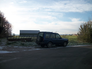
This car was outside one of the farms in my village, its nice because it shows the rural car within the rural - the setting for which it was intended for.
It might be nice to contrast it with a Land Rover in an urban setting?


Charli
xx

Visuals

I did this as a powerpoint slide but I really like all the colours together, thought good visuals for joules?

These are also the ones i came up with for barbour, I really like the colour scheme again.

 Katrina